리액트네이티브를 이용한 앱을 만드는 과정에서, 키보드를 통한 입력이 아닌 모바일 기기인 만큼 폼을 구현할때 좋은 사용자 경험을 제공하기 위해 고민하게 되었다. 인증 화면을 구현하며 다양한 시도를 해볼 수 있었다.
리액트네이티브에서의 input은 웹에서 사용하는 input 태그와는 조금 다르지만 비슷한 속성들이 존재해서 이 속성들을 잘 활용하면 좀 더 나은 사용자 경험을 제공할 수 있다.
📌 Contents
폼 만들기
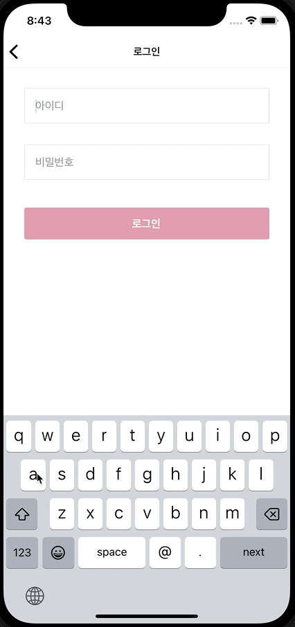
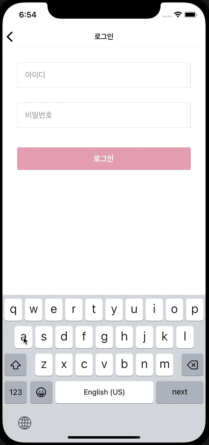
우선 간단한 로그인 폼을 만들어보자. 리액트네이티브에서는 텍스트 입력을 위해 기본적으로 TextInput 컴포넌트를 제공한다. 이를 이용해서 InputField 라는 공통컴포넌트를 만들었다. border 내에 입력값과 유효성 메세지를 포함하는 형태로 구현하였다.
InputField 컴포넌트
interface InputFieldProps extends TextInputProps {
  touched?: boolean;
  error?: string;
}

function InputField({ touched, error, ...props }: InputFieldProps) {
  return (
    <View style={styles.container}>
      <TextInput
        style={styles.input}
        placeholderTextColor={colors.GRAY}
        {...props}
      />
      {touched && error && <Text style={styles.error}>{error}</Text>}
    </View>
  );
}

const styles = StyleSheet.create({
  // 스타일 생략
});

export default InputField;
폼 핸들링
리액트의 onChange 와 다르게 onChangeText를 이용하면 e.target 을 사용하지 않고 폼을 핸들링할 수 있다. blur 함수 또한 사용 가능하다. 처음부터 에러메세지를 보여주기보다는, touched 상태에 따라 표시하도록 하였다.
function LoginScreen() {
  const [values, setValues] = useState({
    username: "",
    password: "",
  });
  const [touched, setTouched] = useState({});

  const handleChangeText = (name: string, text: string) => {
    setValues({
      ...values,
      [name]: text,
    });
  };

  const handleBlur = (name: string) => {
    setTouched({
      ...touched,
      [name]: true,
    });
  };

  return (
    <SafeAreaView>
      <View style={styles.container}>
        <InputField
          placeholder="아이디"
          value={values.username}
          onBlur={() => handleBlur("username")}
          onChangeText={text => handleChangeText("username", text)}
        />
        <InputField
          placeholder="비밀번호"
          value={values.password}
          onBlur={() => handleBlur("password")}
          onChangeText={text => handleChangeText("password", text)}
        />
        <CustomButton label="로그인" variant="filled" size="large" />
      </View>
    </SafeAreaView>
  );
}
useForm 커스텀 훅으로 분리
그리고 폼 핸들링 로직을 분리하고, 페이지에서는 getTextInputProps 유틸함수를 이용하여 사용할 수 있도록 커스텀 훅을 구현했다.
import useForm from "@/hooks/useForm";
function LoginScreen() {
const login = useForm({
initialValue: { username: "", password: "" },
validate: validateLogin,
});
return (
<SafeAreaView>
<View style={styles.container}>
<InputField
{...login.getTextInputProps("username")}
error={login.errors.username}
touched={login.touched.username}
placeholder="아이디"
/>
<InputField
{...login.getTextInputProps("password")}
error={login.errors.password}
touched={login.touched.password}
placeholder="비밀번호"
/>
<CustomButton label="로그인" variant="filled" size="large" />
</View>
</SafeAreaView>
);
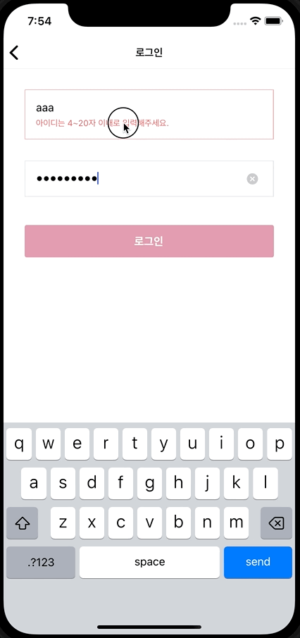
}이제 의도한 대로 유효성 메세지가 잘 출력된다.
기본 속성 활용하기
자동 대문자 방지하기 & autoFocus
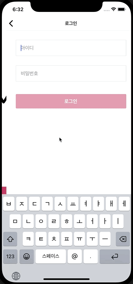
지금은 로그인 입력창을 터치해서 키보드를 띄워야하고, 포커싱 했을때 자동 대문자가 활성화 되어있다. 기본적으로 autoCapitalize 속성으로 이를 방지하고, 아이디 인풋에는 autoFocus를 추가하여 바로 키보드를 띄워주도록 변경했다.
// InputField.tsx
<View>
  <TextInput
    style={styles.input}
    autoCapitalize="none"    {...props}
  />
</View>

// LoginScreen.tsx
<InputField
  autoFocus  {...login.getTextInputProps("username")}
  error={login.errors.username}
  touched={login.touched.username}
  placeholder="아이디"
/>
알맞은 키보드 제공하기 & secureTextEntry
inputMode를 이용하면 상황에 따라 알맞은 키보드를 띄워줄 수 있다. 예를들어 입력해야하는 입력값이 이메일 형태라면 email, 숫자라면 numeric 등을 활용하여 상황에 맞는 키보드를 띄우는 것이 좋다. 비밀번호는 웹에서의 type='password' 와 같은 속성이 없지만 secureTextEntry 속성을 이용하면 된다.
<InputField
autoFocus
{...login.getTextInputProps('username')}
error={login.errors.username}
touched={login.touched.username}
placeholder="아이디"
inputMode="email"/>
<InputField
{...login.getTextInputProps('password')}
error={login.errors.password}
touched={login.touched.password}
placeholder="비밀번호"
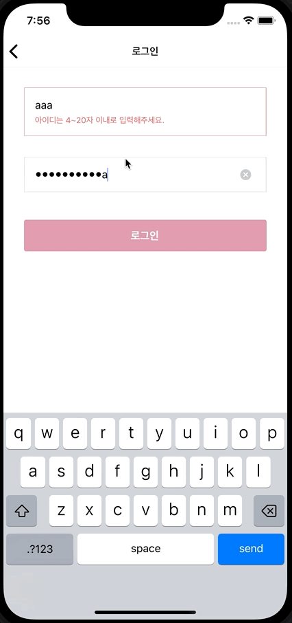
secureTextEntry/>이제 페이지 첫 방문시 자동 포커싱이 되고 email 모드인 경우 키보드 배열에 @가 추가되며 배열이 달라진것을 볼 수 있다.
자연스럽게 커서 이동하기 & returnKeyType
현재는 아이디를 입력하고 리턴키를 누르면 키보드가 닫히고, 다시 다음값을 입력하기 위해 비밀번호 인풋을 클릭해야하는 번거로움이 있다.
returnKeyType을 이용해서 상황에 따라 어떻게 리턴키를 보여줄지 지정할 수 있다. 하지만 키보드 리턴키를 바꾸더라도, 기본적으로 리턴키를 누르면 키보드가 닫힌다.
이때 blurOnSubmit 속성을 이용하면 키보드가 자동으로 닫히지 않는다. 그리고 ref 와 onSubmitEditing을 이용한다면 리턴키 클릭시 키보드를 닫지 않고 동시에 자연스럽게 커서를 이동시켜줄 수 있다.
마지막 인풋의 onSubmitEditing 에는 sumbit 함수를 넣어서 키보드 리턴키로 제출가능 하도록 한다.
const passwordRef = useRef<TextInput | null>(null);

<InputField
  autoFocus
  {...login.getTextInputProps('username')}
  error={login.errors.username}
  touched={login.touched.username}
  placeholder="아이디"
  inputMode="email"
  blurOnSubmit={false}
  returnKeyType="next"  onSubmitEditing={() => {    passwordRef.current?.focus();  }}/>
<InputField
  {...login.getTextInputProps('password')}
  error={login.errors.password}
  touched={login.touched.password}
  ref={passwordRef}
  placeholder="비밀번호"
  secureTextEntry
  returnKeyType="send"  onSubmitEditing={handleSubmit}/>
이제 사용자가 굳이 다시 인풋창을 눌러 키보드를 띄울 필요가 없이 연속으로 입력할 수 있다.
기타 속성들 활용하기
키보드 상단에 붙어있는 스펠링 체크 bar는 굳이 보여줄 필요가 없다면
autoCorrect와 spellCheck 속성을 false로 지정하면 된다.
또한 기기 OS에 따라 활용가능한 속성들도 있다. 예를들어 iOS에서는 clearButtonMode를 지정하여 사용자가 쉽게 인풋창을 초기화할 수 있는 버튼을 제공할 수도 있다.
<TextInput
  style={styles.input}
  autoCapitalize="none"
  placeholderTextColor={colors.GRAY}
  autoCorrect={false}  spellCheck={false}  clearButtonMode="while-editing"  {...props}
/>
기기에 따른 다른 속성들도 존재하니 공식문서를 참고해보자.
탭하기 쉽게 개선하기
위에서 만든 InputField 컴포넌트는 에러메세지를 보여줄때 인풋창 크기가 늘어나며 border 내부에 에러메세지가 표시된다.
이를 수정하기 위해서는 아래와 같이 유효성 검사에 실패한 특정 인풋창을 터치하게 된다.
하지만 모바일 기기특성상 정확히 인풋창을 터치하는것보다, 에러메세지를 포함한 뷰를 터치하면 focus 가 가도록 한다면 더욱 쉽게 탭할 수 있을 것이다.
따라서 InputField 컴포넌트를 Pressable로 감싸고, 내부적으로 ref 를 사용해서 포커싱이 가능하도록 했다.
그런데 부모컴포넌트에서 onSubmitEditing 동작을 위한 ref 를 이미 넘겨주고 있어서, 내부 ref 와 전달받은 ref 를 같이 사용하기 위해 callback ref 를 이용했다.
interface InputFieldProps extends TextInputProps {
  touched?: boolean;
  error?: string;
}

const InputField = forwardRef(
  (
    { touched, error, ...props }: InputFieldProps,
    ref?: ForwardedRef<TextInput>
  ) => {
    const innerRef = useRef<TextInput | null>(null);

    const handlePressInput = () => {
      innerRef.current?.focus();
    };

    return (
      <Pressable onPress={handlePressInput}>
        <View>
          <TextInput
            ref={node => {              ref?.current = node; // type error              innerRef.current = node;            }}            //...
          />
          {touched && error && <Text>{error}</Text>}
        </View>
      </Pressable>
    );
  }
);
이때 ForwardedRef 타입에러가 발생하여 함수 타입을 분기처리하여 해결하고, 이 부분을 mergeRefs 함수로 분리했다.
function mergeRefs<T>(...refs: ForwardedRef<T>[]) {
  return (node: T) => {
    refs.forEach(ref => {
      if (typeof ref === "function") {
        ref(node);
      } else if (ref) {
        ref.current = node;
      }
    });
  };
}
const InputField = forwardRef(
(
{ touched, error, ...props }: InputFieldProps,
ref?: ForwardedRef<TextInput>
) => {
//...
return (
<Pressable onPress={handlePressInput}>
<View>
<TextInput
ref={mergeRefs(innerRef, ref)} //...
/>
{touched && error && <Text>{error}</Text>}
</View>
</Pressable>
);
}
);이제 의도한 대로 인풋 내부를 클릭하면 포커싱이 잘 되는 것을 볼 수 있다.
애니메이션 추가하기
마지막으로 에러메세지를 표시할때, LayoutAnimation을 이용하여 간단한 spring 효과를 추가해 보았다. 에러메세지의 딱딱한 느낌이 줄어든 것 같다.